Because no wall in your home should be left as a blank canvas, we’re looking at trending interior paint colors for 2019 to get you inspired before the summer season is over and we go full-throttle into fall. From which paint colors will work best in which rooms throughout your home to paint color ideas for accent walls to create conversation-starting visual interest in any room, take in the 10 best paint color ideas to try for the year ahead and beyond.
And we bet you’ll be surprised at some of the latest paint colors to make Pantone’s yearly forecast and how easily you can introduce them into your home as sometimes all it takes is a fresh coat of paint to reenergize a room. To make it easier for you, we surveyed Décor Aid interior designers for their takes on the latest paint colors to give a go.
HAZELNUT
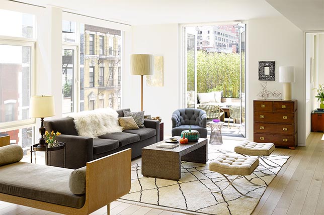
Warm and inviting creamy shades of hazelnut paint colors are sure to never go out of style nor ever clash with existing furnishings as it makes for one comforting go-to of a hue.
For hazelnut paint color ideas in your home, take a quick survey from room to room and consider which spaces need to be brightened up and catch more light as varying shades of hazelnut are great for bouncing light off to make a room appear larger than it is.
LILAC GRAY
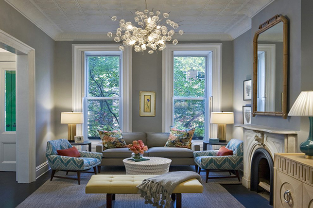
Though dove gray is one of the most classic paint colors when looking for modern alternatives to stark neutral paint color ideas, there’s something a tad moodier about 2019’s lilac undertone injected options.
For one, the addition of lilac works to make gray hues warmer, more gender neutral and cheery. And as some of our designers favorite home interior colors revolve around varying shades of gray, an option boasting lilac tones makes for a refreshing alternative that also happens to be subtle enough to not tire of it easy. We recently made a strong case for the hue on an interior design project in Brooklyn that came alive with a warm, minimal feel.
DARK GREENS
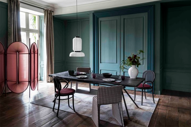
Officially called ‘night watch’ and one of Pantone’s top 2019 paint colors, the hue is basically a new take on rich hunter green that hasn’t looked so viable since its last time in the interior design spotlight in the 90’s.
From muted to moody, this deep green color trend can work to emulate the feeling of lush botanicals and the healing power of nature in your home while setting the tone with a strong foundational hue.
For hunter and bottle green paint color ideas, our interior designers suggest that this trend should be reserved for well-lit, large rooms as its intensity can overpower small spaces and make them look darker. And as always, when considering bringing in the latest paint colors in your home, think about what works with your lifestyle, taste, and design direction as no paint color trend is worth sacrificing your own personal aesthetic.
MUTED PASTELS
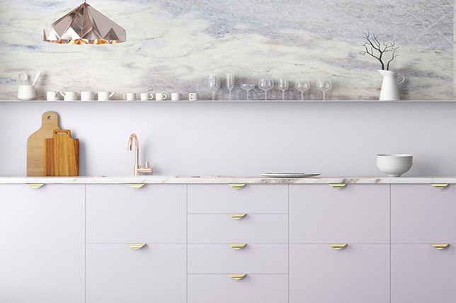
Pastel derivatives in chalky, muted tones, have a soothing appeal that brings with them an understated vibe that’s perfect for gender neutral rooms and common areas like kitchens and bathrooms as they’ll do double duty and conceal everyday scuff marks and nicks. Plus, muted pastels make for a warm backdrop for minimalist design.
We love how the kitchen featured above combines the latest paint colors and a dramatic marble backsplash in complimentary tones that are sure to make it more memorable than a standard black and white kitchen.
Go for similar muted pastel paint colors if you’re looking for the unexpected without having to commit to a bold color trend or the latest paint colors being touted as an ‘it’ hue as you’ll tire of it in the long run, and run the risk of having similar paint colors as your friends and neighbors.
SOFT CLAY
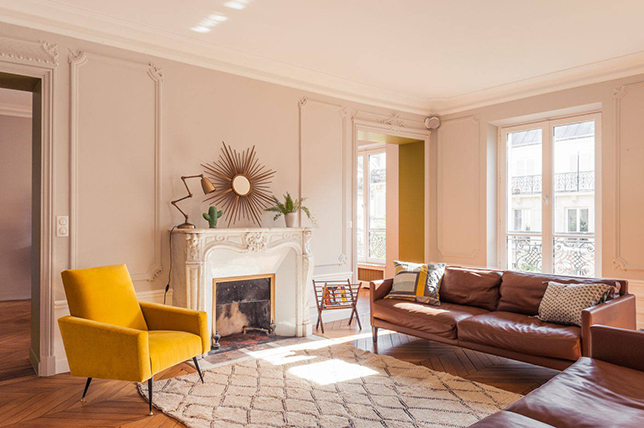
Evoke the spirit of Miami with zesty hues. For those with wanderlust and an earthy spirit, soft clay paint colors are great alternatives to beiges and browns as they’ll lend any room a certain sunny zest and casual elegance. Think terra cotta, caramel, clove, and burnt orange home interior colors that have more personality than any neutral ever could.
For this interior design trend, we suggest going for the latest paint colors that boast unusual takes on clay tones to make any room a feature in your home or go for an accent wall or backsplash and see how effectively the hue can elevate a room and your mood with ease.
NEW BLUES
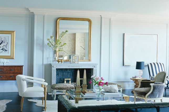
For the traditionalist with a casual approach to interior design, charcoal blue, ice blue, gray-blue, and a very pale powder blue are great options when looking for paint colors that are far from every day yet subtle enough to not take over a room.
With an endless amount of alternative blue paint color ideas available, there’s no limit to the number of routes you can go with this exacting tone. Just be sure that any blue home interior colors you go for remain soothing and spare to avoid a heavy-handed hue that will make a room feel smaller, darker, and stuck in an 80’s nautical time warp. In general, when going for hues known to leave a strong initial impact, tone it down with a more muted, and subtle color palette to get the longest run from your selection.
MUSTARD
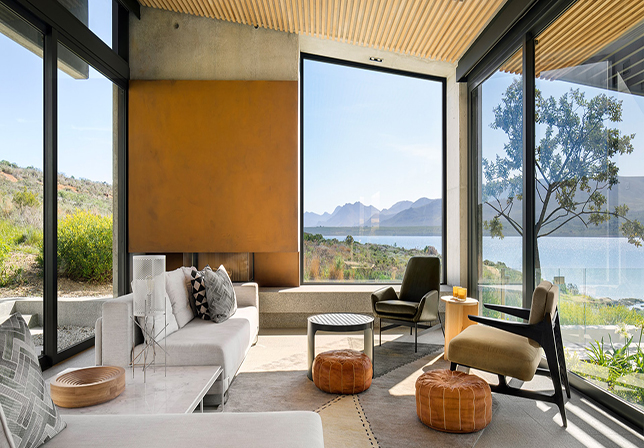
For those looking for a pop of color and an alternative to gold, deep mustard is great for instantly creating rich focal accents and make for smart paint colors for accent walls and even trim.
Do go for muted and moody mustard home interior colors to create provocative depth, and to highlight décor and art brilliantly as sometimes the best paint color ideas are applied in small doses.
MIST
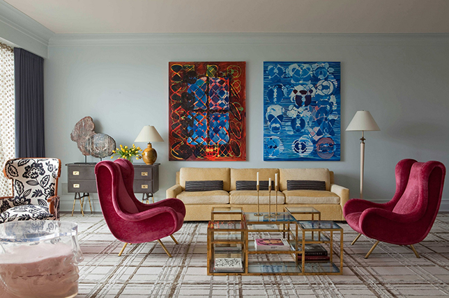
A non-color of sorts, mist home interior colors may come from a blend of muted pastel blue and green with a gray and lilac undertone, but it’s far from an easter egg hue.
Instead, think of this color trend as a blank canvas for décor of all colors and styles as its a much more interesting starting point than standard beiges and whites, plus, like muted pastels, a misty hue will work to cover up blemishes with ease.
MUSHROOM
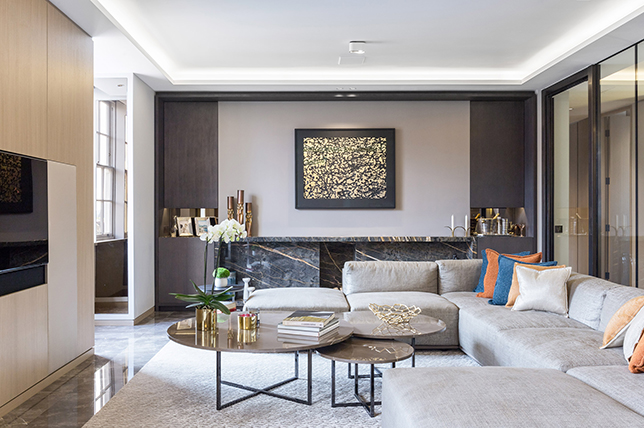
An update to the popular 70’s era mousy browns and rust paint colors, mushroom looks fresh again thanks to a newfound appreciation for everything natural yet moody.
One of our favorite fashion and paint colors for 2019, shades of mushroom are also gender neutral, timeless in appeal, and unique enough to have guests taking note for their own homes. Plus, it looks great with natural furnishings and finishes as seen in the room above.
PEWTER
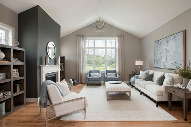
The perfect gray-beige and a rich alternative to all white walls, pewter pain colors provide an almost blank canvas that’s anything but bland.
Though it should have been a standard before it was shortlisted as one of the best paint colors for 2019, this is one color trend not to be underestimated. In fact, our interior designers suggest taking pewter paint color ideas throughout your home rather than just one room as its one shade that works with everything, everywhere
